Youth clothing e-commerce
Sacoor One
Youth clothing e-commerce
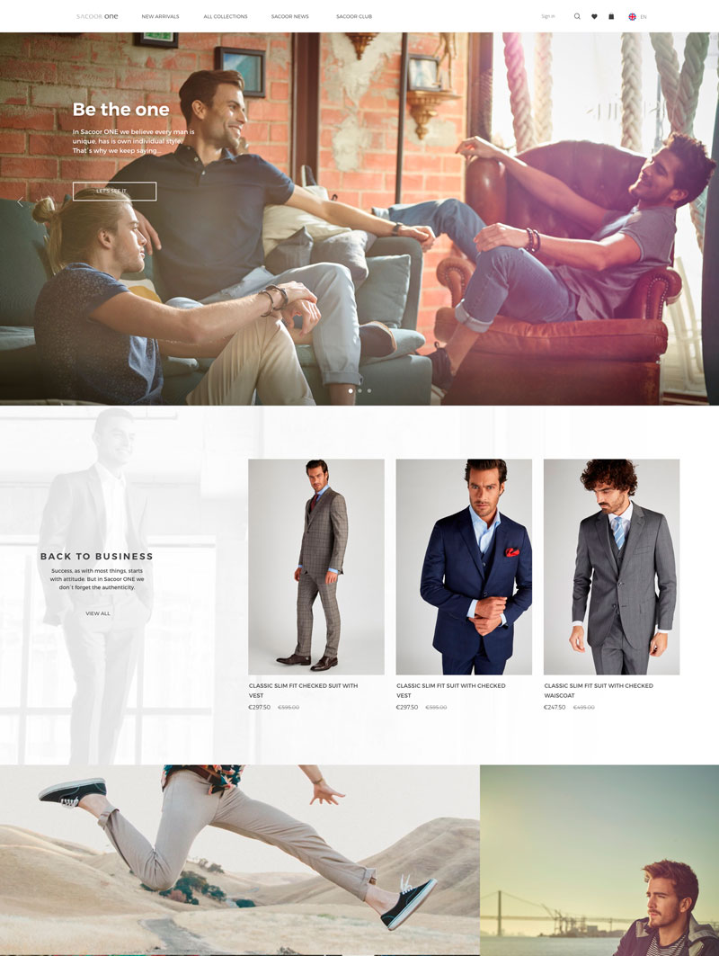
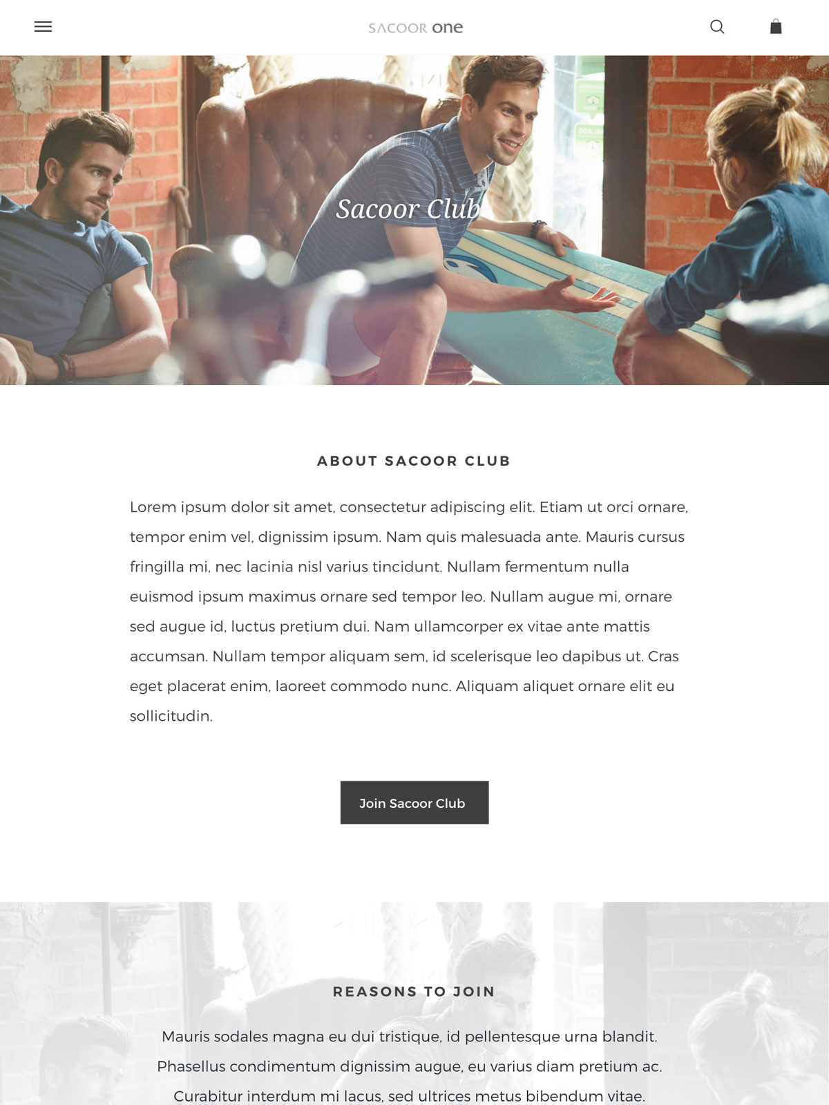
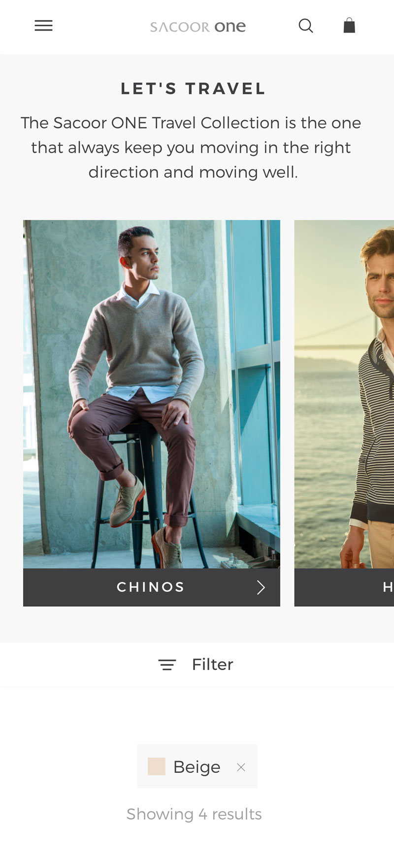
Sacoor Brothers is a Portuguese luxury clothing retail company that began in 1989 with a small store in Lisbon and now has now grown into an internationally recognized brand with more that 100 stores across the world. Sacoor One is a Brand inside Sacoor Brothers company, it offers a line of youth clothing based on the comfort and versatility of the garment, always aligned with the last fashion trends. Our team was commissioned to redesign Sacoor One’s website and implement it on Salesforce Commerce Cloud.
Date 2019
Agency VISEO
Role UX/UI Designer | Front-end developer
Methods Heuristic analysis, Competitive analysis, Prototyping, Scrum
Tools Adobe Xd, Salesforce Commerce Cloud, Jira
Taking into account that Sacoor Brothers is growing in recent years, the company’s strategy is to increase its internet presence by relaunching new websites for each one of its brands. The first website to be redesigned was Sacoor One, the company’s youth clothing brand. The main objective and the challenge for the UX/UI Team was to increase the modest conversion rate of its predecessor.
As an initial research, I analyzed the existing Sacoor One’s website to identify the main problems and pain point that people found when using the product so I could understand the reason of the poor conversion rate.
1 | Not visually appealing
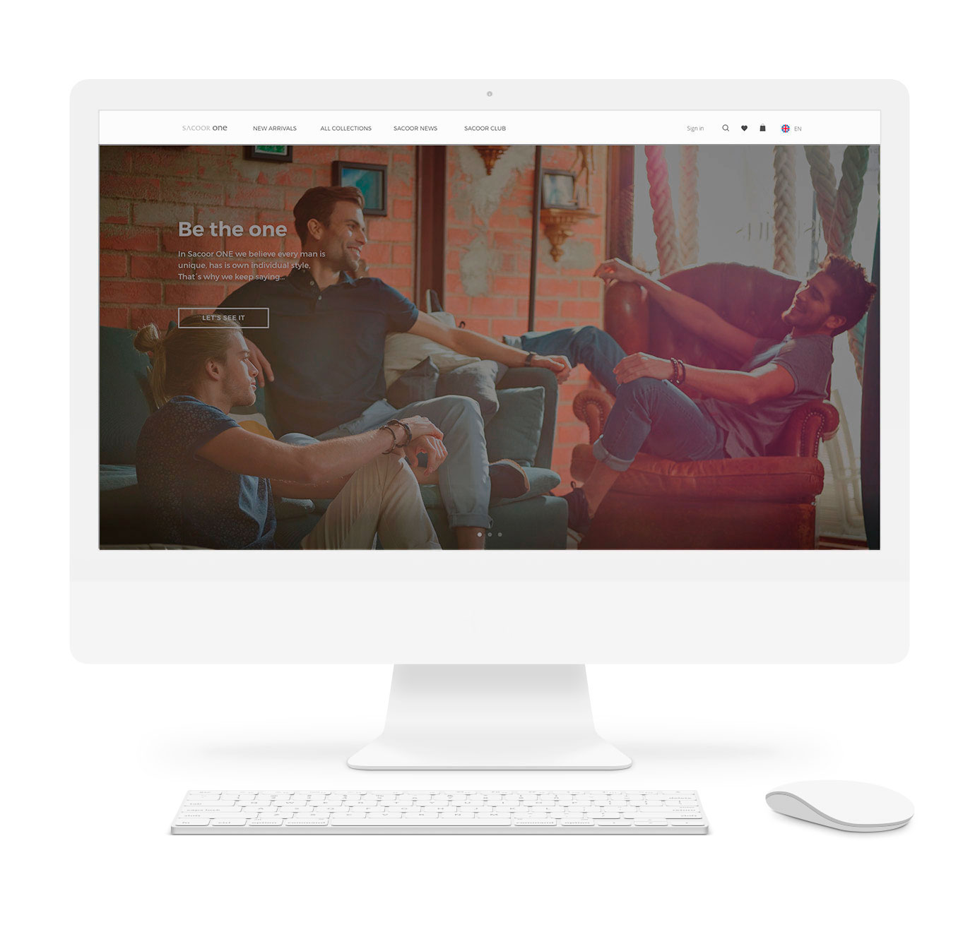
The web design was not consistent with the style guide and was not aligned with the look & feel of the brand. The catalog pictures, that are crucial to see how the product will look like, were not very inviting.
2 | Complicated checkout
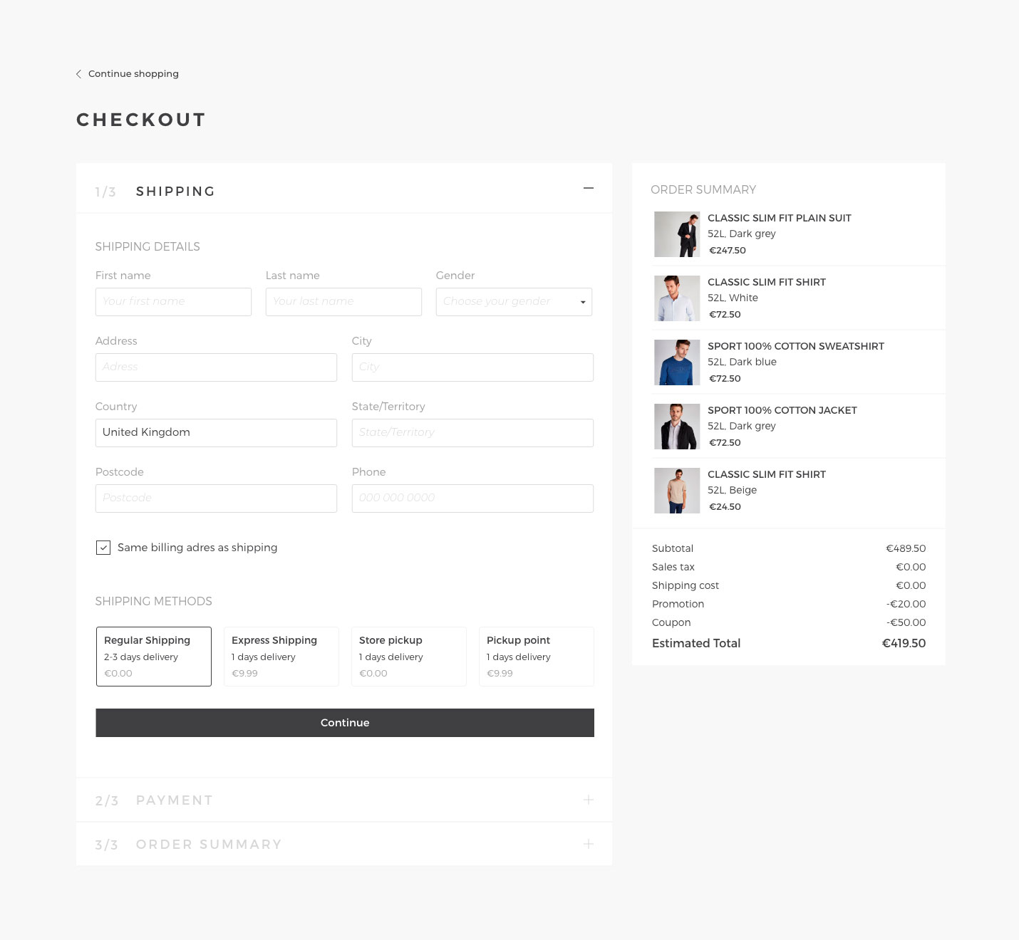
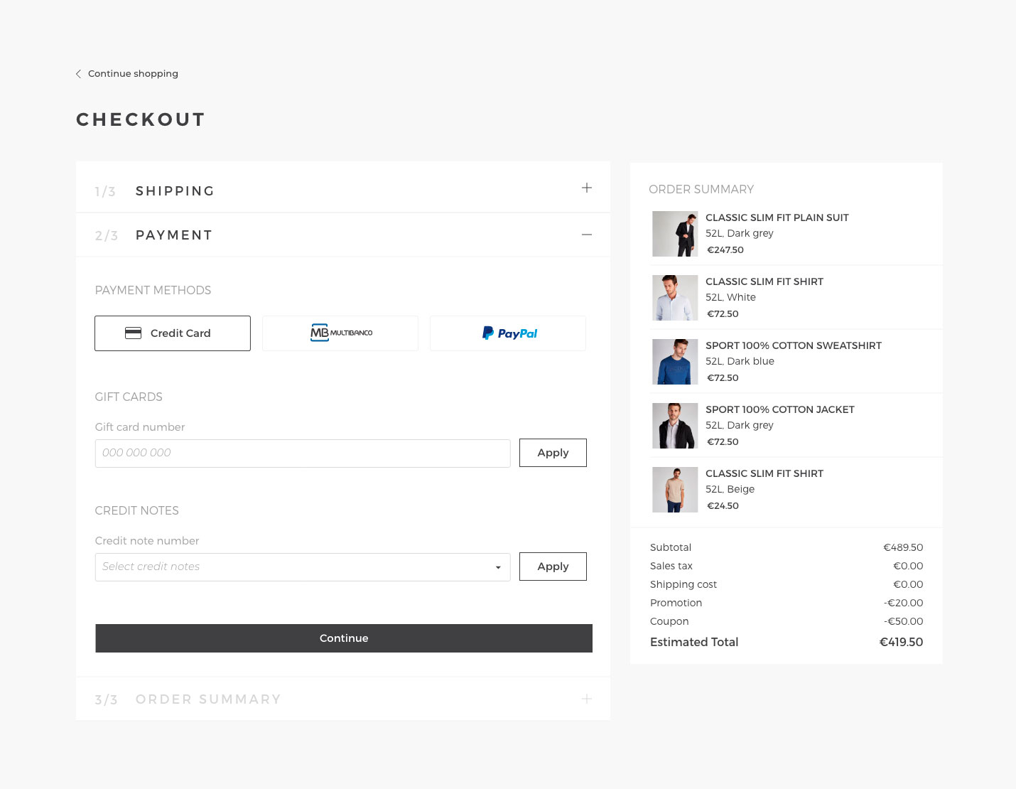
The checkout process was too long and complicated. The user didn’t receive any feedback of the number of steps pending and which was the current step. There were too many form inputs, some of them unnecesary, plus, there was no option to buy as a guest.
3 | Lack of content
There were few products per category, the product description didn’t specify some important information for the user, in general, the entire website seemed to be unfinished.
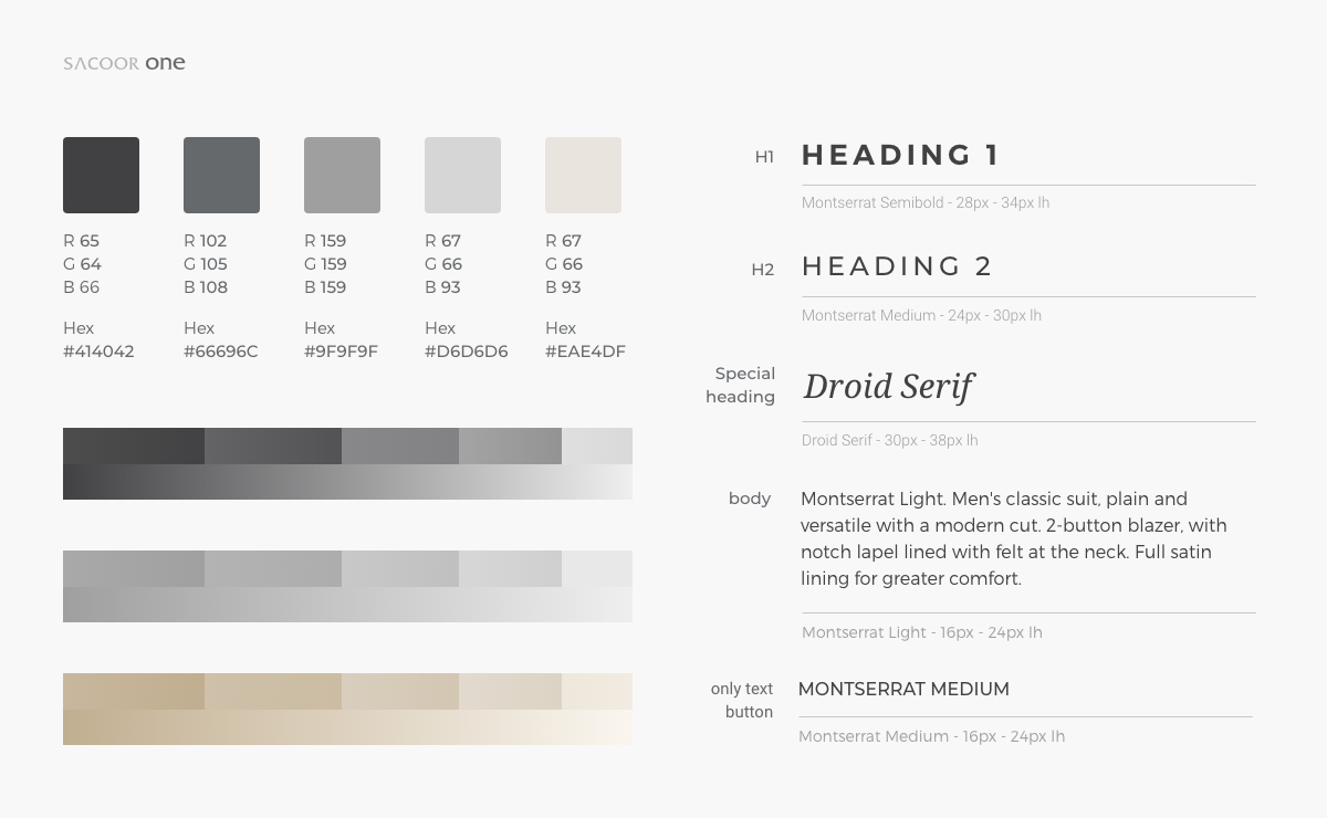
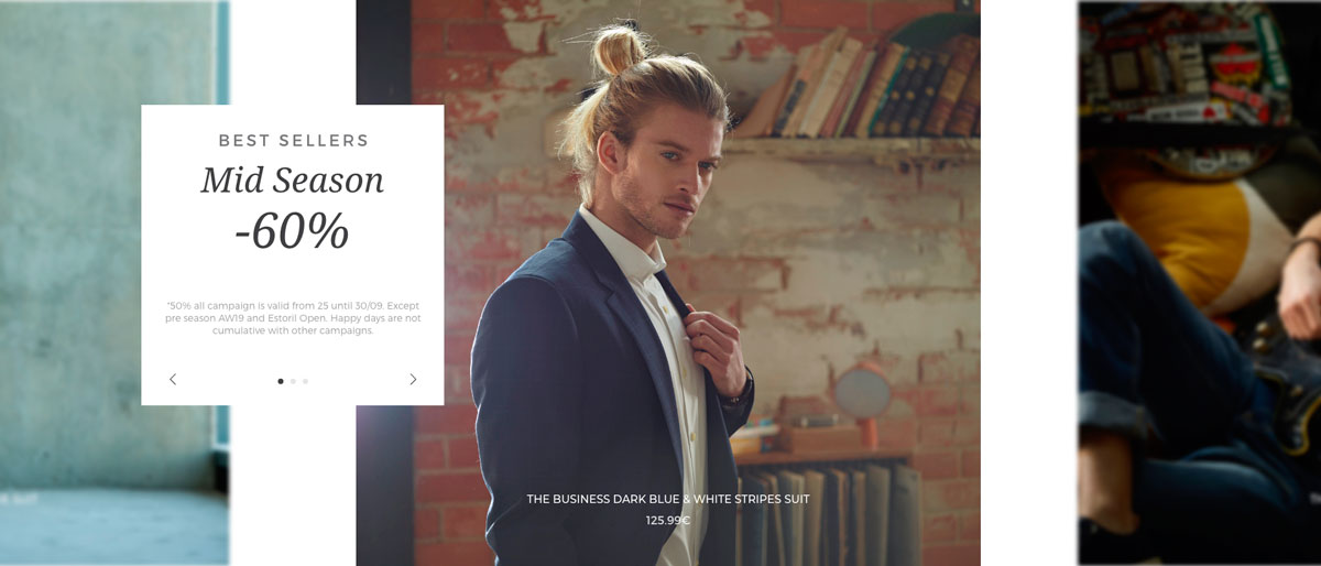
All the elements in Sacoor One’s UI are simple and neutral, we played with brand colors (gray and black) and white to design a sophisticated and elegant experience yet clean and minimalistic, so it won’t clash with product pictures.
We reduced the number of inputs to the essential minimum, minimizing the friction, and we could concentrate all the content on a one-page-checkout, divided in two main steps (shipping, payment) and a summary to check the data entered and edit if necessary. In addition, the “checkout as guest” feature was included to maximize the conversion rate.
Responding the customer needs, we designed layouts, components, component variations and assets so could be reused on any page of the site, an existing one or a page created in the future by Sacoor. The customer can simply create a new page, choose any of the designed modules and customize them with their content via the Page Designer or Content Slots / Assets tools on SFCC.


Play Video